Getting To The Bottom Of Minimum WCAG-Conformant Interactive Element Size
Eric Bailey 2024-07-19T13:00:00+00:00
2024-07-24T15:45:53+00:00
There are many rumors and misconceptions about conforming to WCAG criteria for the minimum sizing of interactive elements. I’d like to use this post to demystify what is needed for baseline compliance and to point out an approach for making successful and inclusive interactive experiences using ample target sizes.
Minimum Conformant Pixel Size
Getting right to it: When it comes to pure Web Content Accessibility Guidelines (WCAG) conformance, the bare minimum pixel size for an interactive, non-inline element is 24×24 pixels. This is outlined in Success Criterion 2.5.8: Target Size (Minimum).

Success Criterion 2.5.8 is level AA, which is the most commonly used level for public, mass-consumed websites. This Success Criterion (or SC for short) is sometimes confused for SC 2.5.5 Target Size (Enhanced), which is level AAA. The two are distinct and provide separate guidance for properly sizing interactive elements, even if they appear similar at first glance.
SC 2.5.8 is relatively new to WCAG, having been released as part of WCAG version 2.2, which was published on October 5th, 2023. WCAG 2.2 is the most current version of the standard, but this newer release date means that knowledge of its existence isn’t as widespread as the older SC, especially outside of web accessibility circles. That said, WCAG 2.2 will remain the standard until WCAG 3.0 is released, something that is likely going to take 10–15 years or more to happen.
SC 2.5.5 calls for larger interactive elements sizes that are at least 44×44 pixels (compared to the SC 2.5.8 requirement of 24×24 pixels). At the same time, notice that SC 2.5.5 is level AAA (compared to SC 2.5.8, level AA) which is a level reserved for specialized support beyond level AA.

Sites that need to be fully WCAG Level AAA conformant are rare. Chances are that if you are making a website or web app, you’ll only need to support level AA. Level AAA is often reserved for large or highly specialized institutions.
Making Interactive Elements Larger With CSS Padding
The family of padding-related properties in CSS can be used to extend the interactive area of an element to make it conformant. For example, declaring padding: 4px; on an element that measures 16×16 pixels invisibly increases its bounding box to a total of 24×24 pixels. This, in turn, means the interactive element satisfies SC 2.5.8.

This is a good trick for making smaller interactive elements easier to click and tap. If you want more information about this sort of thing, I enthusiastically recommend Ahmad Shadeed’s post, “Designing better target sizes”.
I think it’s also worth noting that CSS margin could also hypothetically be used to achieve level AA conformance since the SC includes a spacing exception:
The size of the target for pointer inputs is at least 24×24 CSS pixels, except where:
Spacing: Undersized targets (those less than 24×24 CSS pixels) are positioned so that if a 24 CSS pixel diameter circle is centered on the bounding box of each, the circles do not intersect another target or the circle for another undersized target;
[…]
The difference here is that padding extends the interactive area, while margin does not. Through this lens, you’ll want to honor the spirit of the success criterion because partial conformance is adversarial conformance. At the end of the day, we want to help people successfully click or tap interactive elements, such as buttons.
What About Inline Interactive Elements?
We tend to think of targets in terms of block elements — elements that are displayed on their own line, such as a button at the end of a call-to-action. However, interactive elements can be inline elements as well. Think of links in a paragraph of text.
Inline interactive elements, such as text links in paragraphs, do not need to meet the 24×24 pixel minimum requirement. Just as margin is an exception in SC 2.5.8: Target Size (Minimum), so are inline elements with an interactive target:
The size of the target for pointer inputs is at least 24×24 CSS pixels, except where:
[…]
Inline: The target is in a sentence or its size is otherwise constrained×the line-height of non-target text;
[…]

Apple And Android: The Source Of More Confusion
If the differences between interactive elements that are inline and block are still confusing, that’s probably because the whole situation is even further muddied by third-party human interface guidelines requiring interactive sizes closer to what the level AAA Success Criterion 2.5.5 Target Size (Enhanced) demands.
For example, Apple’s “Human Interface Guidelines” and Google’s “Material Design” are guidelines for how to design interfaces for their respective platforms. Apple’s guidelines recommend that interactive elements are 44×44 points, whereas Google’s guides stipulate target sizes that are at least 48×48 using density-independent pixels.
These may satisfy Apple and Google requirements for designing interfaces, but are they WCAG-conformant Apple and Google — not to mention any other organization with UI guidelines — can specify whatever interface requirements they want, but are they copasetic with WCAG SC 2.5.5 and SC 2.5.8?
It’s important to ask this question because there is a hierarchy when it comes to accessibility compliance, and it contains legal levels:
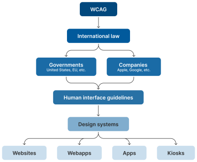
Human interface guidelines often inform design systems, which, in turn, influence the sites and apps that are built by authors like us. But they’re not the “authority” on accessibility compliance. Notice how everything is (and ought to be) influenced by WCAG at the very top of the chain.
Even if these third-party interface guidelines conform to SC 2.5.5 and 2.5.8, it’s still tough to tell when they are expressed in “points” and “density independent pixels” which aren’t pixels, but often get conflated as such. I’d advise not getting too deep into researching what a pixel truly is. Trust me when I say it’s a road you don’t want to go down. But whatever the case, the inconsistent use of unit sizes exacerbates the issue.
Can’t We Just Use A Media Query?
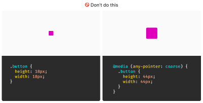
I’ve also observed some developers attempting to use the pointer media feature as a clever “trick” to detect when a touchscreen is present, then conditionally adjust an interactive element’s size as a way to get around the WCAG requirement.
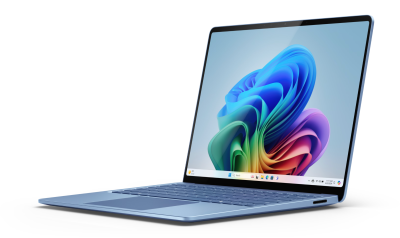
After all, mouse cursors are for fine movements, and touchscreens are for more broad gestures, right? Not always. The thing is, devices are multimodal. They can support many different kinds of input and don’t require a special switch to flip or button to press to do so. A straightforward example of this is switching between a trackpad and a keyboard while you browse the web. A less considered example is a device with a touchscreen that also supports a trackpad, keyboard, mouse, and voice input.
You might think that the combination of trackpad, keyboard, mouse, and voice inputs sounds like some sort of absurd, obscure Frankencomputer, but what I just described is a Microsoft Surface laptop, and guess what? They’re pretty popular.
Responsive Design Vs. Inclusive Design
There is a difference between the two, even though they are often used interchangeably. Let’s delineate the two as clearly as possible:
- Responsive Design is about designing for an unknown device.
- Inclusive Design is about designing for an unknown user.
The other end of this consideration is that people with motor control conditions — like hand tremors or arthritis — can and do use mice inputs. This means that fine input actions may be painful and difficult, yet ultimately still possible to perform.
People also use more precise input mechanisms for touchscreens all the time, including both official accessories and aftermarket devices. In other words, some devices designed to accommodate coarse input can also be used for fine detail work.
I’d be remiss if I didn’t also point out that people plug mice and keyboards into smartphones. We cannot automatically say that they only support coarse pointers:
My point is that a mode-based approach to inclusive design is a trap. This isn’t even about view–tap asymmetry. Creating entire alternate experiences based on assumed input mode reinforces an ugly “us versus them” mindset. It’s also far more work to set up, maintain, and educate others.
It’s better to proactively accommodate an unknown number of unknown people using an unknown suite of devices in unknown ways by providing an inclusive experience by default. Doing so has a list of benefits:
- More proactively accommodating,
- Less effort to create,
- Less effort to maintain,
- Less data to download, and
- Less compliance risk.
After all, that tap input might be coming from a tongue, and that click event might be someone raising their eyebrows.
WCAG Is The Floor, Not The Ceiling
A WCAG-conformant 24×24 minimum pixel size requirement for interactive elements is our industry’s best understanding of what can accommodate most access needs distributed across a global population accessing an unknown amount of content dealing with unknown topics in unknown ways under unknown circumstances.
The load-bearing word in that previous sentence is minimum. The guidance — and the pixel size it mandates — is likely a balancing act between:
- Setting something up that is functional enough while also
- Avoiding a standard that would be impossible to broadly achieve (hence the SC 2.5.5 level AAA rating).
Even the SC itself acknowledges this potential limitation:
“This Success Criterion defines a minimum size and, if this can’t be met, a minimum spacing. It is still possible to have very small and difficult-to-activate targets and meet the requirements of this Success Criterion.”
Larger interactive areas can be a good thing to strive for. This is to say a minimum of approximately 40 pixels may be beneficial for individuals who struggle with the smaller yet still WCAG-conformant size.
Interactive Area Sizing Is As Much An Art As It Is A Science
We should also be careful not to overcorrect by dropping in gigantic interactive elements in all of our work. If an interactive area is too large, it risks being activated by accident. This is important to note when an interactive element is placed in close proximity to other interactive elements and even more important to consider when activating those elements can result in irrevocable consequences.
There is also a phenomenon where elements, if large enough, are not interpreted or recognized as being interactive. Consequently, users may inadvertently miss them, despite large sizing.

Context Is King
Conformant and successful interactive areas — both large and small — require knowing the ultimate goals of your website or web app. When you arm yourself with this context, you are empowered to make informed decisions about the kinds of people who use your service, why they use the service, and how you can accommodate them.
For example, the Glow Baby app uses larger interactive elements because it knows the user is likely holding an adorable, albeit squirmy and fussy, baby while using the application. This allows Glow Baby to emphasize the interactive targets in the interface to accommodate parents who have their hands full.

In the same vein, SC SC 2.5.8 acknowledges that smaller touch targets — such as those used in map apps — may contextually be exempt:
For example, in digital maps, the position of pins is analogous to the position of places shown on the map. If there are many pins close together, the spacing between pins and neighboring pins will often be below 24 CSS pixels. It is essential to show the pins at the correct map location; therefore, the Essential exception applies.
[…]
When the “Essential” exception is applicable, authors are strongly encouraged to provide equivalent functionality through alternative means to the extent practical.
Note that this exemption language is not carte blanche to make your own work an exception to the rule. It is more of a mechanism, and an acknowledgment that broadly applied rules may have exceptions that are worth thinking through and documenting for future reference.
Further Considerations
We also want to consider the larger context of the device itself as well as the environment the device will be used in.
Larger, more fixed position touchscreens compel larger interactive areas. Smaller devices that are moved around in space a lot (e.g., smartwatches) may benefit from alternate input mechanisms such as voice commands.
What about people who are driving in a car? People in this context probably ought to be provided straightforward, simple interactions that are facilitated via large interactive areas to prevent them from taking their eyes off the road. The same could also be said for high-stress environments like hospitals and oil rigs.
Similarly, devices and apps that are designed for children may require interactive areas that are larger than WCAG requirements for interactive areas. So would experiences aimed at older demographics, where age-derived vision and motor control disability factors tend to be more present.
Minimum conformant interactive area experiences may also make sense in their own contexts. Data-rich, information-dense experiences like the Bloomberg terminal come to mind here.
Design Systems Are Also Worth Noting
While you can control what components you include in a design system, you cannot control where and how they’ll be used by those who adopt and use that design system. Because of this, I suggest defensively baking accessible defaults into your design systems because they can go a long way toward incorporating accessible practices when they’re integrated right out of the box.
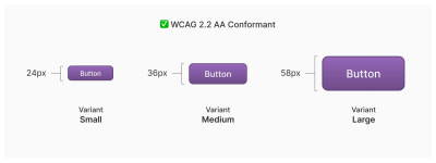
One option worth consideration is providing an accessible range of choices. Components, like buttons, can have size variants (e.g., small, medium, and large), and you can provide a minimally conformant interactive target on the smallest variant and then offer larger, equally conformant versions.
So, How Do We Know When We’re Good?
There is no magic number or formula to get you that perfect Goldilocks “not too small, not too large, but just right” interactive area size. It requires knowledge of what the people who want to use your service want, and how they go about getting it.
The best way to learn that? Ask people.
Accessibility research includes more than just asking people who use screen readers what they think. It’s also a lot easier to conduct than you might think! For example, prototypes are a great way to quickly and inexpensively evaluate and de-risk your ideas before committing to writing production code. “Conducting Accessibility Research In An Inaccessible Ecosystem” by Dr. Michele A. Williams is chock full of tips, strategies, and resources you can use to help you get started with accessibility research.
Wrapping Up
The bottom line is that
“Compliant” does not always equate to “usable.” But compliance does help set baseline requirements that benefit everyone.
“
To sum things up:
- 24×24 pixels is the bare minimum in terms of WCAG conformance.
- Inline interactive elements, such as links placed in paragraphs, are exempt.
- 44×44 pixels is for WCAG level AAA support, and level AAA is reserved for specialized experiences.
- Human interface guidelines by the likes of Apple, Android, and other companies must ultimately confirm to WCAG.
- Devices are multimodal and can use different kinds of input concurrently.
- Baking sensible accessible defaults into design systems can go a long way to ensuring widespread compliance.
- Larger interactive element sizes may be helpful in many situations, but might not be recognized as an interactive element if they are too large.
- User research can help you learn about your audience.
And, perhaps most importantly, all of this is about people and enabling them to get what they need.
Further Reading
- Foundations: target sizes (TetraLogical)
- Large Links, Buttons, and Controls (Web Accessibility Initiative)
- Interaction Media Features and Their Potential (for Incorrect Assumptions) (CSS-Tricks)
- Meeting WCAG Level AAA (TetraLogical)
(gg, yk)